
June 2026

How to Shoot in Golden Hour: 7 Settings for Warm Portrait Photography

Why Golden Hour Portrait Photography Still Wins in 2026 Golden hour is that magical window roughly 45 to 60 minutes before sunset (or just after sunrise) when the sun sits low on the horizon and bathes everything in soft, warm, directional light. For portrait photographers, it is the closest thing we have to a free professional lighting kit. Skin tones glow, harsh shadows disappear, and even tricky backgrounds turn into painterly bokeh. But here is the truth most tutorials skip: golden hour does not do all the work for you. If your camera settings are wrong, you will get muddy skin tones, blown-out highlights, or worse, that cold blue cast that completely kills the mood. In this guide, we walk you through the exact settings, white balance choices, and positioning techniques we use on real wedding and engagement shoots to make the most of this light. Understanding Golden Hour Light Before You Touch Your Camera Before diving into settings, remember three things about golden hour light: It moves fast. You typically have 45 to 60 minutes, and the last 10 minutes are the warmest. It is directional. Where you place your subject relative to the sun changes everything. It shifts color temperature quickly. What looks neutral at 7:15 PM looks deep amber at 7:35 PM. Scout your location at least 30 minutes early. Use an app like PhotoPills or Sun Surveyor to know exactly where the sun will set. The 7 Camera Settings for Warm Golden Hour Portraits 1. Shoot in Manual Mode (or Aperture Priority with Exposure Compensation) Auto mode will fight you during golden hour. The camera sees the warm cast and tries to neutralize it. Switch to Manual if you are confident, or Aperture Priority (A/Av) with exposure compensation dialed in. 2. Aperture: Open Wide for That Creamy Glow Use a wide aperture between f/1.8 and f/2.8 for single subjects. This creates separation, melts the background into warm bokeh, and lets you keep ISO low even as the light fades. Single portrait: f/1.8 to f/2.2 Couples: f/2.5 to f/2.8 Small groups: f/3.5 to f/4 3. Shutter Speed: Stay Above Your Focal Length A common mistake is letting shutter speed drop too low because the scene looks bright. Keep it at minimum 1/200s for portraits, especially if your subject is moving (walking, laughing, twirling). 4. ISO: Start Low, Adjust as Light Fades Begin at ISO 100 or 200. As the sun drops, bump it gradually. Modern full-frame cameras handle ISO 1600 to 3200 beautifully, so do not be afraid to push it in the final minutes. Time Before Sunset Aperture Shutter ISO 60 min f/2.8 1/500s 100 30 min f/2.0 1/320s 200 10 min f/1.8 1/200s 800 After sunset (blue hour) f/1.8 1/160s 2000 5. White Balance: Manual Kelvin Is Your Best Friend Auto White Balance is the enemy of warmth. It detects the orange tones and cools them down. Set white balance manually: 5500K to 6000K: Natural, true-to-life warmth 6500K to 7500K: Cinematic, amber, dreamy 8000K+: Heavy stylized warmth (use sparingly) Pro tip: shoot in RAW so you can fine-tune Kelvin later without quality loss. 6. Metering Mode: Spot Meter on the Skin Evaluative or matrix metering averages the whole scene and often underexposes faces when the bright sun is in the frame. Switch to spot metering and meter directly on your subject’s cheek. This guarantees properly exposed skin even with backlight. 7. Exposure Compensation: Push +0.3 to +1.0 When backlighting your subject (the most flattering golden hour setup), your camera will underexpose. Dial in +0.7 to +1.0 EV to brighten skin tones and let those golden flares shine through. Positioning Your Subject: The Three Best Angles Backlit (Sun Behind the Subject) The most iconic golden hour look. Place the sun directly behind your subject’s head or shoulder. You get a glowing rim light, hair that catches fire, and dreamy lens flare. Use a lens hood removed and meter for the face. Side-lit (Sun at 90 Degrees) Creates depth and dimension with soft shadows on one side of the face. Perfect for moody, editorial portraits. Use a small reflector on the shadow side if you want to fill in. Front-lit (Sun Behind You) The sun gently illuminates the subject’s face with that warm glow. Best in the final 15 minutes when the sun is no longer harsh. Ask your subject not to squint by counting to three before you click. Real Example: How Small Adjustments Change Everything On a recent engagement session, we shot the same pose three times within 90 seconds: Shot 1: Auto WB, evaluative metering, no compensation. Result: cool tones, dark faces, flat mood. Shot 2: WB set to 6200K, spot metering on cheek, +0.7 EV. Result: balanced warmth, glowing skin, soft background. Shot 3: WB pushed to 7400K, +1.0 EV, sun directly behind the couple’s heads. Result: cinematic, amber, the kind of image clients frame on their wall. Same couple. Same location. Same minute. The settings made all the difference. Common Mistakes to Avoid Leaving Auto White Balance on (kills the warmth) Forgetting to check focus when shooting into the sun (use back-button AF) Standing still: move your subject every 60 seconds as the light shifts Ignoring the 5 minutes after sunset (blue hour) which gives you stunning pastel tones Not bringing a reflector or even a white sheet for fill light Gear That Makes Golden Hour Easier Lens hood (or your hand) to control flare when you want it controlled 50mm f/1.8 or 85mm f/1.8 for the dreamiest compression 5-in-1 reflector (gold side adds extra warmth) ND filter if you want to shoot wide open earlier in the hour FAQ: Golden Hour Portrait Photography What time exactly is golden hour? Golden hour is approximately the last 45 to 60 minutes before sunset and the first 45 to 60 minutes after sunrise. The exact duration depends on your latitude and season. Use apps like PhotoPills, Sun Surveyor, or Golden Hour One to get precise times for your location. Is sunrise or sunset

How to Shoot in Golden Hour: 7 Settings for Warm Portrait Photography Read More »

How to Create a Brand Color Palette: A Designer’s Step-by-Step Method

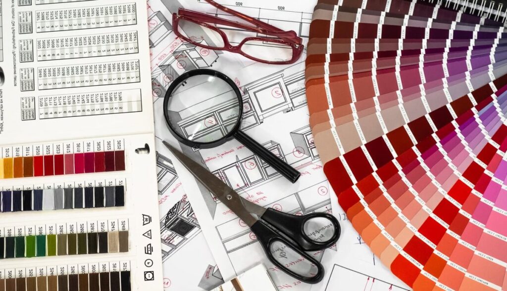
Your brand color palette does more than look pretty. It shapes how clients feel the second they land on your website, open your proposal, or scroll past your Instagram post. For wedding professionals especially, color is the difference between booking premium clients and blending into a sea of pastel sameness. In this guide, I’ll walk you through the exact step-by-step method I use with clients to build cohesive, accessible, and conversion-ready brand color palettes. No fluff, no generic Canva tutorials. Just a real designer’s workflow you can replicate today. What Is a Brand Color Palette (and Why It Matters) A brand color palette is a curated set of colors (usually 4 to 6) that represent your brand consistently across every touchpoint: website, logo, social media, packaging, and printed materials. A strong palette typically includes: 1 to 2 primary colors (your dominant brand identity) 2 to 3 secondary colors (supporting tones) 1 accent color (used for buttons, highlights, calls to action) Neutrals (background, text, breathing room) Color increases brand recognition by up to 80%. Get this right, and everything else in your visual identity becomes ten times easier. Step 1: Define Your Brand Personality First Before you touch a color picker, write down 5 to 7 adjectives that describe your brand. Skip vague words like “professional” or “modern.” Get specific. Examples for wedding industry brands: Editorial, romantic, refined, sun-drenched, slow Bold, modern, architectural, fearless, urban Earthy, intimate, handcrafted, warm, grounded These words become your filter. Every color you consider must match at least three of them. If “electric blue” doesn’t fit “romantic and sun-drenched,” it’s out. Step 2: Run a Competitor Color Audit This step is skipped by 90% of beginners and it’s where pros gain their edge. Pull up 8 to 10 competitors in your niche and screenshot their websites. Competitor Dominant Color Mood Gap You Can Fill Brand A Cream / Beige Soft, neutral Saturated warmth Brand B Dusty Pink Feminine Deeper jewel tones Brand C Sage Green Organic Moody, dark green The goal isn’t to copy. It’s to spot what every competitor is doing so you can do something distinct while staying relevant to your market. Step 3: Build a Mood Board (Not on Pinterest) Pinterest is fine for ideas, but the algorithm will keep showing you the same trending palettes everyone else is using. Instead, pull inspiration from: Editorial magazines (Kinfolk, Cereal, Vogue Italia) Film stills from cinematographers you admire Architecture and interior design portfolios Vintage book covers and album art Nature photography from a specific location tied to your brand Drop 15 to 20 images into a Figma or Milanote board. Look for color repetition across at least 5 images. Those are your candidates. Step 4: Select Your Primary Colors Choose 1 or 2 colors that will carry the most visual weight. These appear in your logo, hero sections, and headers. Rules of thumb: Pick a primary that works on both light and dark backgrounds Avoid pure black (#000000) and pure white (#FFFFFF). Use warm off-blacks and soft creams instead Test your primary in three sizes: a full hero section, a logo on a business card, and a 16px icon Real Example: Editorial Wedding Photographer Primary 1: Deep Bordeaux (#5C1A1B) Primary 2: Warm Ivory (#F2EBDD) Step 5: Add Secondary Colors Secondary colors fill the space between your primaries. They’re used for section backgrounds, illustrations, and supporting graphics. Use the 60-30-10 rule: 60% of your design uses neutrals or your dominant primary 30% uses your secondary colors 10% uses your accent color Continuing the example, secondaries could be a Dusty Rose (#D4A5A0) and a Sage Olive (#7A7B5C). Step 6: Choose One Accent Color The accent is the loudest color in your palette. It’s used sparingly for buttons, links, and anything you want to draw the eye to. This is where bookings happen. Your accent should: Contrast strongly against your primary and neutrals Be unexpected but harmonious Pass accessibility contrast checks (more on that next) For our Bordeaux brand, a Terracotta Gold (#C97B3F) accent would pop on “Book Now” buttons without clashing. Step 7: Test Accessibility (Non-Negotiable) If your text isn’t readable, your palette has failed. Use these free tools to check every color combination you plan to use for text: WebAIM Contrast Checker (webaim.org/resources/contrastchecker) Stark (Figma plugin) Adobe Color Accessibility Tools Minimum standards to hit: Content Type Minimum Ratio (WCAG AA) Normal text 4.5:1 Large text (18px+ bold or 24px+) 3:1 UI components / buttons 3:1 Roughly 1 in 12 men have some form of color blindness. Run your palette through a simulator like Coblis to make sure your CTAs still stand out. Step 8: Document Your Palette in a Style Guide A palette only works if it’s used consistently. Save the following for every color in a one-page brand sheet: HEX code (web) RGB values (digital) CMYK values (print) Pantone match (if you do high-end print work) Usage rule: “Use this color for headlines only,” etc. Tools I Actually Recommend in 2026 Coolors.co: Fast palette generation and locking specific colors while exploring Adobe Color: Best for harmony rules and accessibility checks in one place Realtime Colors: Preview your palette on a real website layout instantly Figma + Stark plugin: For designers building production-ready palettes Khroma: AI-trained on your personal taste, surprisingly good for fresh combos Common Mistakes to Avoid Too many colors. If you have 9 colors, you have no brand. Cap it at 6. Chasing trends. Viva Magenta felt fresh in 2023, dated by 2025. Build for 5 years, not 5 months. Ignoring print. What looks luxurious on screen can print muddy. Always test. Skipping neutrals. Your eye needs rest. Pure color on pure color is exhausting. Not stress-testing in context. A palette in isolation lies. Drop it onto a real mockup before committing. Frequently Asked Questions How many colors should a brand palette have? Between 4 and 6 colors is the sweet spot: 1 to 2 primaries, 2 to 3 secondaries, 1 accent, plus your neutrals. More than that and you lose cohesion.

How to Create a Brand Color Palette: A Designer’s Step-by-Step Method Read More »

Typography Pairing Tips for Web Design: How to Combine Fonts That Work

Choosing fonts for a website can feel overwhelming. There are thousands of typefaces out there, and picking two that look good together seems like a guessing game. But typography pairing for web design follows a few simple rules that anyone can learn. In this guide, we break down how to combine fonts that create visual harmony, improve readability, and strengthen your brand identity. Why Typography Pairing Matters in Web Design Typography is more than just decoration. It guides the reader’s eye, establishes hierarchy, and sets the tone of your entire website. A well-paired font duo can make your content feel professional, trustworthy, and easy to navigate. A poor pairing, on the other hand, can make even great content look amateur. Good font pairing helps you: Create a clear visual hierarchy between headings and body text Improve readability across devices Reinforce your brand personality Keep users engaged longer on your pages The Core Principles of Font Pairing Before diving into specific combinations, let’s cover the fundamental rules that every web designer should follow. 1. Contrast Is Your Best Friend The most effective font pairings rely on contrast. When two fonts are too similar, they compete for attention. When they’re clearly different, they complement each other. You can create contrast through: Style: pair a serif with a sans serif Weight: combine a bold display font with a light body font Size: use a large heading paired with smaller, more modest paragraph text Mood: contrast a decorative typeface with a neutral one 2. Establish a Clear Hierarchy Your typography should tell the reader what to look at first, second, and third. Use one font for headings and another for body text. Then vary size, weight, and spacing to guide attention through the page. 3. Limit Yourself to Two or Three Fonts More fonts equal more chaos. Stick to two typefaces for most projects. If you need a third, use it sparingly for accents like buttons or captions. 4. Match the Mood Your font pairing should match your brand’s personality. A wedding photography site benefits from elegant serifs and refined scripts. A tech startup might lean toward geometric sans serifs. Always consider the emotional message your typography sends. 5. Prioritize Readability Beautiful fonts that no one can read are useless. For body text, choose typefaces with good x-height, clear letterforms, and adequate spacing. Test your fonts at different sizes on mobile and desktop before committing. Classic Font Pairing Formulas That Always Work Here are four reliable formulas you can use as a starting point for almost any web project. Formula 1: Serif Heading + Sans Serif Body This is the most timeless combination. The serif adds character and authority to headings, while the sans serif keeps body text clean and easy to read on screens. Formula 2: Sans Serif Heading + Serif Body A modern twist on the classic. The bold sans serif heading feels contemporary, while the serif body text adds warmth and readability for longer content like blog posts. Formula 3: Two Sans Serifs With Different Weights Pick one geometric or display sans for headings and a more humanist or neutral sans for body text. This works beautifully for tech, minimalist, and editorial designs. Formula 4: Display Font + Neutral Sans Serif Use a bold or decorative display font for hero headlines, then balance it with a clean sans serif for everything else. Great for creative agencies, fashion, and lifestyle brands. 10 Web-Ready Font Pairings You Can Use Today All the pairings below are available for free through Google Fonts, making them easy to drop into any web project. Heading Font Body Font Best For Playfair Display Source Sans Pro Wedding, editorial, luxury Montserrat Merriweather Blogs, magazines Oswald Lato Sports, bold business sites Cormorant Garamond Proxima Nova Photography, weddings Poppins PT Serif Startups, SaaS Libre Baskerville Open Sans Corporate, legal, finance Raleway Roboto Portfolios, creative agencies Abril Fatface Work Sans Fashion, lifestyle DM Serif Display DM Sans Modern brands, marketing Inter Inter Tech, minimalist UI Common Font Pairing Mistakes to Avoid Even with good intentions, designers often fall into the same traps. Watch out for these pitfalls: Pairing two fonts that are too similar. Two humanist sans serifs side by side will look like a mistake, not a design choice. Using too many fonts. Three is the absolute maximum. Two is usually better. Ignoring weight options. Make sure both fonts come with multiple weights so you have flexibility for hierarchy. Forgetting about performance. Every font you load slows down your site. Use only the weights and styles you actually need. Skipping mobile testing. A pairing that looks elegant on desktop may be unreadable on a small screen. Tools to Help You Find the Perfect Pairing If you’re still unsure, these tools take the guesswork out of typography pairing: Fontjoy: generates AI-powered font pairings in one click Fontpair: a curated library of Google Font combinations Google Fonts: built-in pairing suggestions for every typeface Typespiration: full design templates with matching fonts and color palettes Figma: experiment with pairings directly in your design files A Step-by-Step Workflow for Pairing Fonts Use this simple process the next time you start a new web project: Define your brand mood. Is it elegant, playful, technical, or bold? Choose your heading font first. Pick something that captures personality. Select a neutral body font. It should contrast your heading and stay highly readable. Test at multiple sizes. View headings, subheadings, paragraphs, and captions together. Check on real devices. Always preview on both desktop and mobile. Refine spacing and weight. Adjust line height, letter spacing, and font weight until the hierarchy feels natural. Final Thoughts Typography pairing in web design is part science, part art. Once you understand contrast, hierarchy, and mood, the process becomes much less intimidating. Start with one of the proven combinations above, test it in your design, and adjust based on your brand’s personality. The right font pairing can transform an ordinary website into a memorable one. Frequently Asked Questions How many fonts should I use

Typography Pairing Tips for Web Design: How to Combine Fonts That Work Read More »

How to Batch Edit Photos in Lightroom: A Complete Workflow for Faster Editing

If you’ve ever come back from a wedding with 2,000 RAW files staring at you from your hard drive, you already know that editing them one by one is not a viable business model. Learning how to batch edit photos in Lightroom is the single biggest time-saver in a professional wedding photographer’s workflow, and in this guide we’re going to walk through the exact process we use at Digital Wedding Pro to deliver client galleries faster without sacrificing quality. Unlike most tutorials that stop at “click sync,” we’ll cover the full pipeline: culling, syncing, auto-sync, applying presets across hundreds of images, dealing with mixed lighting scenes, and exporting in bulk. We’ll also share real timing comparisons so you can see exactly how much time you’ll save. Why Batch Editing Matters for Wedding and Event Photographers A typical 8-hour wedding produces between 1,500 and 3,000 keepers. Editing each photo individually at an average of 90 seconds per image means roughly 37 to 75 hours of editing per wedding. With proper batch editing, that number drops to 4 to 8 hours. Here’s a real comparison from one of our recent 2026 spring weddings (1,847 final images): Workflow Time Per Image Total Time Consistency Manual one by one ~90 sec 46 hours Inconsistent Sync Settings ~12 sec 6 hours High Auto Sync + Presets ~7 sec 3.5 hours Very High AI Adaptive Presets (2026) ~5 sec 2.5 hours Excellent Step 1: Cull Before You Edit Before touching any sliders, get rid of the rejects. Editing photos you’ll never deliver is the most expensive mistake in your workflow. Use the X key to flag rejects and P to flag picks in Library mode Filter by flagged status before moving to the Develop module Group similar shots by event segment: getting ready, ceremony, portraits, reception Grouping is critical because each segment usually has different lighting and will need its own batch settings. Step 2: Edit Your “Hero” Image First Pick one representative photo from the segment you’re about to batch edit. This becomes your reference image. Adjust: White balance Exposure and contrast Highlights and shadows Color grading and HSL Lens corrections and profile Sharpening and noise reduction Take the time to nail this one. Every photo in the batch will inherit these settings, so a 5-minute investment here saves hours later. Step 3: How to Sync Settings Across Multiple Photos This is the core technique for how to batch edit photos in Lightroom Classic. Using Sync (Manual Sync) In the Develop module, make sure your edited “hero” image is the active selection (the one with the lighter border) In the filmstrip at the bottom, hold Shift and click the last photo of the segment, or Ctrl/Cmd + click to select specific images Click the Sync… button at the bottom right of the right panel In the dialog, check only the settings you want to copy. For mixed batches, uncheck Spot Removal, Crop, and Local Adjustments Click Synchronize Using Auto Sync (Live Mode) Auto Sync is even faster when you want every slider movement to apply to all selected photos in real time. Select all the photos you want to edit together in the filmstrip Click the small switch icon to the left of the Sync button to toggle Auto Sync ON Now any adjustment you make affects every selected image instantly Pro tip: Always remember to turn Auto Sync back OFF when you’re done. We’ve seen photographers accidentally apply a +2 exposure to 800 ceremony shots because they forgot. Step 4: Applying Presets Across Hundreds of Photos Presets are your foundation, not your finish. Here’s how we deploy them at scale: In the Library module, switch to Grid view (G) Select all photos from a single lighting segment Open the Quick Develop panel on the right Choose your preset from the Saved Preset dropdown The preset is applied to every selected photo at once For more precision, do it in the Develop module with Auto Sync enabled, then click your preset in the Presets panel. Using Adaptive Presets (Lightroom 2026) Current versions of Lightroom include AI-powered adaptive presets that automatically detect skies, subjects, and skin tones, then adjust each photo accordingly. This is genuinely game-changing for wedding work because: Skin tones get the same treatment regardless of background Skies are balanced individually per image You no longer need separate presets for indoor and outdoor shots Step 5: Handling Exposure Variations Within a Batch Even within the same segment, exposures vary. After syncing, scroll through your filmstrip and use these shortcuts to fine-tune the outliers: Shortcut Action + / – Quick Develop exposure bump Ctrl/Cmd + Shift + M Match Total Exposures Ctrl/Cmd + C / V Copy / Paste settings Match Total Exposures is underused magic. Select your reference photo first, then select the photos you want to match, and Lightroom will normalize the exposure of all selected images to match the reference. Step 6: Bulk Exporting Once your edits are done, batch exporting is the final time-saver. In the Library module Grid view, select all photos to export Press Ctrl/Cmd + Shift + E or right-click and choose Export Save an export preset for each delivery type: Full resolution JPEG, sRGB, quality 85 for client gallery 2048px long edge, sRGB, quality 70 for web preview 1080px square, watermarked for social media Use the Post-Processing dropdown to automatically open the folder when done For very large weddings, enable multi-batch export by running multiple export queues simultaneously. On a modern machine with an SSD, you can export 2,000 images in under 20 minutes. Step 7: Batch Editing in Lightroom (Cloud / Web Version) If you’re using Lightroom CC or the web version instead of Classic, the workflow is slightly different: Edit your hero image Right-click and choose Copy Edit Settings (or Ctrl/Cmd + Shift + C) Select the target images in your library Right-click and choose Paste Edit Settings The web version still lacks true Auto Sync, so Classic remains the better choice for high-volume

How to Batch Edit Photos in Lightroom: A Complete Workflow for Faster Editing Read More »

About us

We offer a variety of services to help you plan your dream wedding, including digital design, wedding photography, and more. We also offer a variety of packages to fit your budget and needs.

Contact Info

Copyright © 2022 Digital Wedding Pro. All Rights Reserved.