Your brand color palette does more than look pretty. It shapes how clients feel the second they land on your website, open your proposal, or scroll past your Instagram post. For wedding professionals especially, color is the difference between booking premium clients and blending into a sea of pastel sameness.
In this guide, I’ll walk you through the exact step-by-step method I use with clients to build cohesive, accessible, and conversion-ready brand color palettes. No fluff, no generic Canva tutorials. Just a real designer’s workflow you can replicate today.
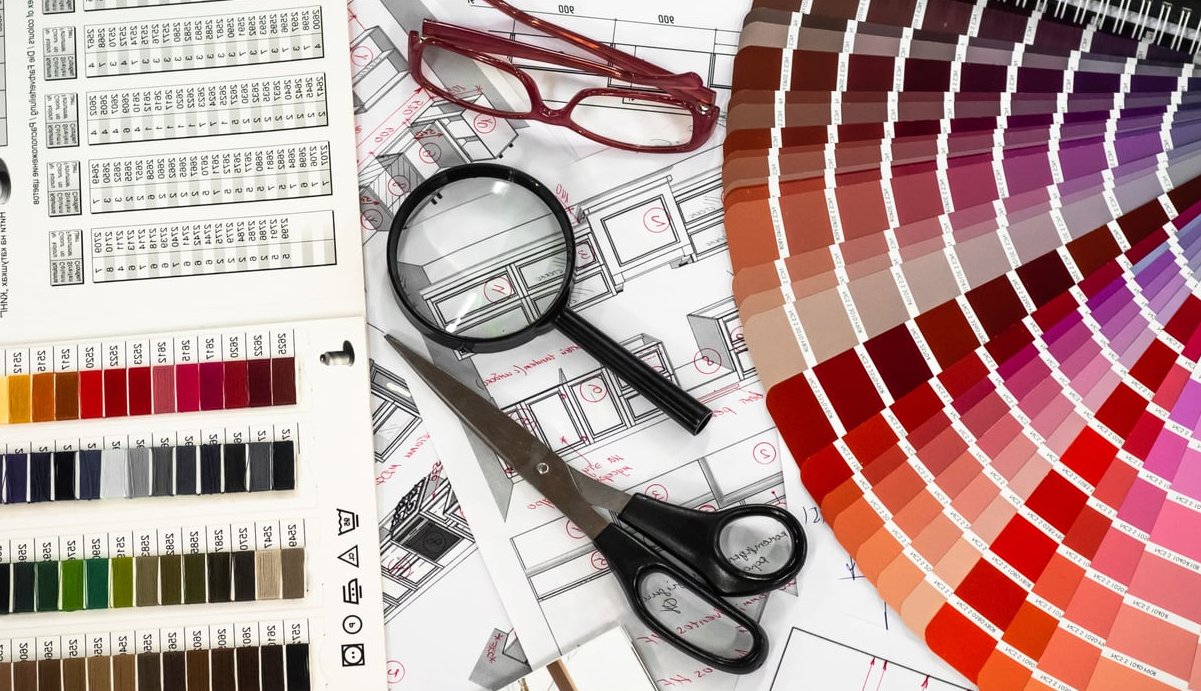
What Is a Brand Color Palette (and Why It Matters)
A brand color palette is a curated set of colors (usually 4 to 6) that represent your brand consistently across every touchpoint: website, logo, social media, packaging, and printed materials. A strong palette typically includes:
- 1 to 2 primary colors (your dominant brand identity)
- 2 to 3 secondary colors (supporting tones)
- 1 accent color (used for buttons, highlights, calls to action)
- Neutrals (background, text, breathing room)
Color increases brand recognition by up to 80%. Get this right, and everything else in your visual identity becomes ten times easier.

Step 1: Define Your Brand Personality First
Before you touch a color picker, write down 5 to 7 adjectives that describe your brand. Skip vague words like “professional” or “modern.” Get specific.
Examples for wedding industry brands:
- Editorial, romantic, refined, sun-drenched, slow
- Bold, modern, architectural, fearless, urban
- Earthy, intimate, handcrafted, warm, grounded
These words become your filter. Every color you consider must match at least three of them. If “electric blue” doesn’t fit “romantic and sun-drenched,” it’s out.
Step 2: Run a Competitor Color Audit
This step is skipped by 90% of beginners and it’s where pros gain their edge. Pull up 8 to 10 competitors in your niche and screenshot their websites.
| Competitor | Dominant Color | Mood | Gap You Can Fill |
|---|---|---|---|
| Brand A | Cream / Beige | Soft, neutral | Saturated warmth |
| Brand B | Dusty Pink | Feminine | Deeper jewel tones |
| Brand C | Sage Green | Organic | Moody, dark green |
The goal isn’t to copy. It’s to spot what every competitor is doing so you can do something distinct while staying relevant to your market.
Step 3: Build a Mood Board (Not on Pinterest)
Pinterest is fine for ideas, but the algorithm will keep showing you the same trending palettes everyone else is using. Instead, pull inspiration from:
- Editorial magazines (Kinfolk, Cereal, Vogue Italia)
- Film stills from cinematographers you admire
- Architecture and interior design portfolios
- Vintage book covers and album art
- Nature photography from a specific location tied to your brand
Drop 15 to 20 images into a Figma or Milanote board. Look for color repetition across at least 5 images. Those are your candidates.

Step 4: Select Your Primary Colors
Choose 1 or 2 colors that will carry the most visual weight. These appear in your logo, hero sections, and headers.
Rules of thumb:
- Pick a primary that works on both light and dark backgrounds
- Avoid pure black (#000000) and pure white (#FFFFFF). Use warm off-blacks and soft creams instead
- Test your primary in three sizes: a full hero section, a logo on a business card, and a 16px icon
Real Example: Editorial Wedding Photographer
- Primary 1: Deep Bordeaux (#5C1A1B)
- Primary 2: Warm Ivory (#F2EBDD)
Step 5: Add Secondary Colors
Secondary colors fill the space between your primaries. They’re used for section backgrounds, illustrations, and supporting graphics.
Use the 60-30-10 rule:
- 60% of your design uses neutrals or your dominant primary
- 30% uses your secondary colors
- 10% uses your accent color
Continuing the example, secondaries could be a Dusty Rose (#D4A5A0) and a Sage Olive (#7A7B5C).
Step 6: Choose One Accent Color
The accent is the loudest color in your palette. It’s used sparingly for buttons, links, and anything you want to draw the eye to. This is where bookings happen.
Your accent should:
- Contrast strongly against your primary and neutrals
- Be unexpected but harmonious
- Pass accessibility contrast checks (more on that next)
For our Bordeaux brand, a Terracotta Gold (#C97B3F) accent would pop on “Book Now” buttons without clashing.
Step 7: Test Accessibility (Non-Negotiable)
If your text isn’t readable, your palette has failed. Use these free tools to check every color combination you plan to use for text:
- WebAIM Contrast Checker (webaim.org/resources/contrastchecker)
- Stark (Figma plugin)
- Adobe Color Accessibility Tools
Minimum standards to hit:
| Content Type | Minimum Ratio (WCAG AA) |
|---|---|
| Normal text | 4.5:1 |
| Large text (18px+ bold or 24px+) | 3:1 |
| UI components / buttons | 3:1 |
Roughly 1 in 12 men have some form of color blindness. Run your palette through a simulator like Coblis to make sure your CTAs still stand out.

Step 8: Document Your Palette in a Style Guide
A palette only works if it’s used consistently. Save the following for every color in a one-page brand sheet:
- HEX code (web)
- RGB values (digital)
- CMYK values (print)
- Pantone match (if you do high-end print work)
- Usage rule: “Use this color for headlines only,” etc.
Tools I Actually Recommend in 2026
- Coolors.co: Fast palette generation and locking specific colors while exploring
- Adobe Color: Best for harmony rules and accessibility checks in one place
- Realtime Colors: Preview your palette on a real website layout instantly
- Figma + Stark plugin: For designers building production-ready palettes
- Khroma: AI-trained on your personal taste, surprisingly good for fresh combos
Common Mistakes to Avoid
- Too many colors. If you have 9 colors, you have no brand. Cap it at 6.
- Chasing trends. Viva Magenta felt fresh in 2023, dated by 2025. Build for 5 years, not 5 months.
- Ignoring print. What looks luxurious on screen can print muddy. Always test.
- Skipping neutrals. Your eye needs rest. Pure color on pure color is exhausting.
- Not stress-testing in context. A palette in isolation lies. Drop it onto a real mockup before committing.
Frequently Asked Questions
How many colors should a brand palette have?
Between 4 and 6 colors is the sweet spot: 1 to 2 primaries, 2 to 3 secondaries, 1 accent, plus your neutrals. More than that and you lose cohesion.
Can I create a brand color palette for free?
Yes. Coolors, Adobe Color, and Canva’s palette generator are all free and produce professional results. The tool matters less than your strategy.
How do I pick colors that match my logo?
Start with your logo as the anchor. Use a color picker to grab its exact HEX, then build outward using complementary or analogous harmony rules in Adobe Color.
Should I follow color trends?
Be aware of them, don’t be ruled by them. Use a trending color as your accent (which is easier to swap later) rather than your primary.
How often should I update my brand palette?
A well-built palette should last 5 to 7 years. Refresh tones slightly every 3 years if needed, but full rebrands should be rare and intentional.
What’s the difference between a brand palette and a website palette?
Your brand palette is the master set used everywhere. Your website palette is a slightly extended version that includes additional shades, tints, and states (hover, disabled, error) needed for UI design.
Final Thoughts
Building a brand color palette isn’t about picking pretty colors. It’s about translating your brand’s personality into a visual system that builds trust, signals quality, and drives action. Follow the eight steps above, test relentlessly, and document everything. Your future self (and your bookings) will thank you.