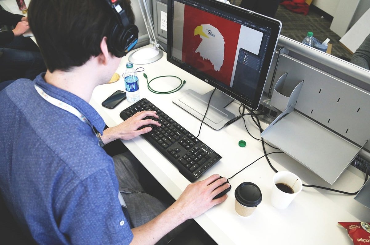

Layout design is the arrangement of visual elements (text, images, shapes, colour and empty space) on a page or screen so that a message is understood quickly and pleasantly. It applies to everything: a wedding invitation, a magazine spread, a poster, a pricing page on your website. If a design ever felt off to you without you being able to say why, the cause was almost always the layout, not the fonts or the colours.
This guide breaks down the six rules that govern every composition, and for each one we describe a before-and-after scenario so you can see exactly what is broken and how to fix it. Layout Design: Everything You Should Know is a useful companion to this.
What Is Layout Design? A Clear Definition
Layout design is the strategic placement and sizing of visual components within a defined space. That space can be a printed A4 sheet, a 5×7 invitation card, a 1920px wide browser window or a 1080×1350 Instagram post.
A layout answers three questions before the viewer even reads a word:
- What do I look at first? (hierarchy)
- Where do my eyes go next? (flow and alignment)
- Does this feel calm or chaotic? (white space and balance)
Layout vs Design vs Composition
These three words get mixed up constantly, so here is the simple distinction:
| Term | What it covers | Example question it answers |
|---|---|---|
| Design | The whole creative solution: concept, colour, typography, imagery, tone | Should this brand feel editorial or romantic? |
| Layout | The structural arrangement: grids, margins, columns, placement | Where does the headline sit and how wide is the text block? |
| Composition | The visual relationship between elements inside the layout | Does the eye travel smoothly from the photo to the date? |
In short: design is the idea, layout is the skeleton, composition is the feeling. Related reading: Graphic Design Layout and Composition.
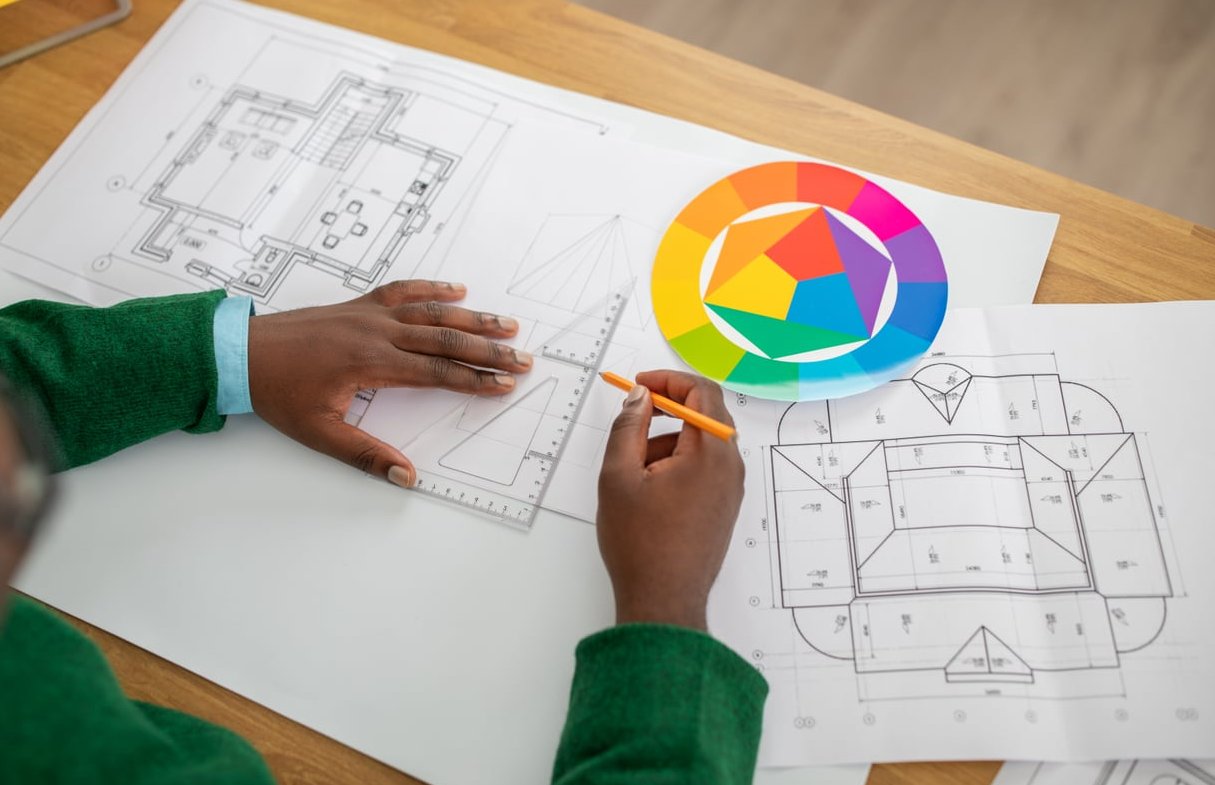
The Building Blocks You Are Arranging
- Type: headlines, subheads, body copy, captions, labels
- Imagery: photos, illustrations, icons, logos
- Shapes and rules: lines, dividers, boxes, colour blocks
- White space: margins, gutters, padding, leading (the most underrated element of all)
- The frame: the page or screen size that constrains everything
The six rules below tell you how those blocks should relate to one another.
Rule 1: Build on a Grid
A grid is an invisible framework of columns, rows, margins and gutters. It is the single fastest way to make amateur work look professional, because it removes guesswork from every placement decision.
Before and after
Before: A wedding pricing page where the intro paragraph starts 40px from the left edge, the three package cards start 55px in, and the testimonial block starts 28px in. Nothing is technically wrong, yet the page feels wobbly, like a shelf hung slightly crooked. Card widths differ by 20px each, so the gaps between them are uneven.
After: A 12-column grid with a 24px gutter and equal 64px outer margins. The intro spans columns 1 to 8, each package card spans exactly 4 columns, and the testimonial spans 1 to 12. Suddenly every left edge lines up down the page, the gaps are identical, and the page reads as one calm system instead of three separate ideas.
Common grid choices
| Grid type | Best for |
|---|---|
| Single column (manuscript) | Long-form text, ebooks, blog articles, vow booklets |
| Two or three column | Brochures, newsletters, editorial spreads |
| 12 column | Websites, because 12 divides neatly by 2, 3, 4 and 6 |
| Modular | Galleries, portfolio grids, product catalogues |
| Baseline grid | Multi-column print where text lines must align across columns |
Quick tip: you are allowed to break the grid, but only once per layout and only on purpose. A single full-bleed photo crossing the grid reads as a deliberate accent. Five broken elements read as a mistake.

Rule 2: Establish Visual Hierarchy
Hierarchy is the order in which the eye consumes information. You create it with size, weight, colour, contrast and position. Without it, the viewer has to do the sorting work themselves, and most will not bother.
Before and after
Before: An event poster where the venue name, the date, the headline act and the ticket price are all set in 24pt bold caps. Everything shouts, so nothing is heard. Squint at it from two metres away and you cannot tell what the poster is even advertising.
After: The headline act jumps to 96pt. The date drops to 32pt medium. The venue sits at 18pt regular. The ticket price becomes a small 14pt line at the bottom. Now three distinct levels exist, and the squint test gives you the artist name instantly, the date second, the details third.
A practical hierarchy recipe
- Write down the three things the viewer must take away, ranked.
- Give level 1 roughly 2 to 3 times the visual weight of level 2.
- Give level 3 the least weight but keep it legible (never below 9pt in print, 14px on screen for body copy).
- Use only one accent colour for emphasis, not three.
The squint test: blur your eyes or zoom out to 25%. Whatever you still see is your hierarchy. If everything blurs into one grey mass, your contrast is too low.
Rule 3: Use White Space Generously
White space (also called negative space) is the empty area between and around elements. It does not have to be white. It is not wasted space, it is the breathing room that makes everything else readable.
Before and after
Before: A wedding photographer’s about page where the portrait photo sits 6px from the paragraph, the paragraph runs edge to edge at 140 characters per line, and the call-to-action button touches the text above it. The page feels cramped and cheap, and readers abandon the paragraph halfway through.
After: Line length capped at 65 to 75 characters. Line height set to 1.6. A 48px gap between photo and text, 80px above and below each section, and a comfortable 64px margin on either side. The exact same copy now feels premium and takes half the effort to read.
White space rules of thumb
- Space between groups should always be larger than space within a group (this is proximity, and it does the grouping work for you).
- Body text line height: 1.4 to 1.6 times the font size.
- Optimal line length: 45 to 75 characters.
- Margins in print: never less than the gutter, and usually more at the bottom than the top.
- When in doubt, remove an element rather than shrink the spacing.
Rule 4: Align Everything to Something
Alignment means every element sits on a shared edge or axis. Nothing should be placed arbitrarily. The invisible lines created by alignment are what the eye actually follows.
Before and after
Before: An editorial spread where the headline is centred, the deck is left aligned, the pull quote is centred again and the caption is right aligned. Four different alignments on one spread create four competing invisible lines, and the page feels scattered.
After: Headline, deck, body and caption all flush left on the same column edge. Only the pull quote is deliberately offset into the outer margin as a single accent. The spread now has one strong vertical spine and reads as a single unit.
Which alignment to use
| Alignment | Use it for | Avoid it for |
|---|---|---|
| Left (flush left, ragged right) | Almost all body copy, UI, web | Rarely a wrong choice |
| Centred | Short formal blocks: invitations, menus, title pages | Paragraphs longer than 3 lines |
| Right | Captions, sidebars, numeric columns | Main reading copy |
| Justified | Narrow print columns with hyphenation on | Web, and any column under 40 characters |
Rule 5: Create Balance
Balance is the distribution of visual weight across the frame. Large, dark, saturated or detailed elements are heavy. Small, light, pale and simple elements are light. mockflow.com goes into the numbers.
Before and after
Before: A save-the-date card with a large dark photograph filling the top two thirds and a single line of thin script floating at the bottom left. The card feels top heavy, as if it is about to tip forward. The bottom third reads as leftover space rather than intentional space.
After (symmetrical option): The photo becomes a centred oval, names centred beneath it, date centred below that. Formal, stable, traditional.
After (asymmetrical option): The photo shifts to the right half and bleeds off the edge. The names sit large in the left third, with the date and location stacked below them. The heavy photo on one side is counterbalanced by the bold type on the other. Modern, editorial, and more interesting than the symmetrical version.
Three types of balance
- Symmetrical: mirrored either side of a central axis. Feels formal, stable, classic. Perfect for invitations and certificates.
- Asymmetrical: different elements of equal visual weight on either side. Feels dynamic and contemporary. Most magazine and web layouts.
- Radial: elements radiate from a central point. Used for seating charts, badges, circular emblems.
Test it: flip your layout horizontally, or turn it upside down. Imbalance becomes obvious immediately once you stop reading the words.
Rule 6: Repeat With Purpose
Repetition means reusing the same visual decisions throughout a piece or a system: the same two typefaces, the same spacing scale, the same button shape, the same photo treatment. It creates unity and signals professionalism.
Before and after
Before: A 12-page wedding guide where page 3 uses 16px body text with 24px spacing, page 7 uses 15px with 30px spacing, subheads are sometimes bold and sometimes italic, and section dividers alternate between a thin line, a dotted line and a small icon. The reader never builds a mental map of the document.
After: One spacing scale (8, 16, 24, 40, 64). One heading style. One divider style. One image treatment. Now the reader learns the system on page 1 and navigates the other 11 pages effortlessly, and the whole guide looks like it cost three times more to produce.
Repetition is also where rhythm comes from. Alternating a full-width image, then a two-column text block, then a full-width image creates a pace that keeps the reader moving.

The Six Rules Applied to Three Real Formats
| Rule | Poster | Editorial spread | Web page |
|---|---|---|---|
| Grid | 3 to 6 columns, generous margins | 2 to 3 columns plus baseline grid | 12 columns, responsive breakpoints |
| Hierarchy | One dominant element readable at 5 metres | Headline, deck, body, caption, folio | H1, subhead, one primary button |
| White space | Empty space is the design | Outer margins wider than gutters | Consistent vertical section padding |
| Alignment | One axis for all information | Text aligns across the gutter | Shared container width throughout |
| Balance | Usually asymmetrical for impact | Weight distributed across both pages | Alternating image and text sides |
| Repetition | Two typefaces maximum | Same caption and folio style on every page | Reusable components and spacing scale |
Types of Layout You Will Actually Use
- Z-pattern: eyes sweep left to right, diagonally down, then left to right again. Ideal for image-light landing pages and simple posters.
- F-pattern: the natural scanning path for text-heavy pages such as blogs and search results. Put the important words at the start of lines.
- Single column: the safest and most readable option for long content and for mobile.
- Split screen: two equal halves, great for offering a clear binary choice or pairing one strong image with one strong message.
- Modular or card grid: repeated tiles of equal or related size, used for galleries, portfolios and blog indexes.
- Magazine or editorial: mixed column widths, pull quotes, full bleed images, strong rhythm.
- Hero plus sections: a dominant opening block followed by stacked, alternating content bands. The standard for modern websites.
A 10 Minute Layout Audit You Can Run Today
- Squint. Can you identify the number one message in under two seconds? If not, fix hierarchy.
- Draw the lines. Print it and draw straight lines along every edge. Do the lines stack up or is each one unique? If unique, fix alignment.
- Measure the gaps. Are related items closer together than unrelated items? If not, fix proximity and white space.
- Count the styles. More than two typefaces, three type sizes per level or two accent colours? Cut back and fix repetition.
- Flip it. Mirror the file. Does one side feel heavy? Fix balance.
- Shrink it. View at 25% or on a phone. Everything that disappears was not carrying its weight anyway.
Five Mistakes Beginners Make (and the Fix)
| Mistake | Fix |
|---|---|
| Filling every empty area | Delete content instead of adding decoration |
| Centring long paragraphs | Flush left for anything over three lines |
| Four or five typefaces | Two families, or one family with several weights |
| Inconsistent spacing values | Adopt an 8 point spacing scale and stick to it |
| Designing desktop first and squeezing it onto mobile | Design the single column mobile version first, then expand |
FAQ
What is the meaning of layout design?
Layout design means arranging visual elements such as text, images, colour and empty space within a fixed frame so information is easy to scan and pleasant to look at. It applies equally to print (invitations, posters, magazines) and digital (websites, apps, social posts).
What are the 5 basic principles of layout and design?
The most commonly cited five are hierarchy, alignment, contrast, proximity and repetition. Add balance and white space and you have the complete working set used by professionals every day.
What are the basic rules for layout design?
Start from a grid, establish one clear focal point, give elements room to breathe, align everything to a shared edge, distribute visual weight evenly and repeat your styling decisions consistently. Then test with the squint test before you deliver.
What are the 7 types of layout?
In graphic design the seven layout types most often listed are: single column, multi column, modular or grid, Z-pattern, F-pattern, split screen and full screen or hero. Note that in operations management the phrase refers to something completely different (process, product, cellular, fixed position and hybrid factory layouts), so check the context before you search.
What is a layout design example?
A wedding invitation is a textbook example: a centred symmetrical layout, generous margins, three levels of hierarchy (names, date, venue details), one script typeface paired with one serif, and consistent spacing between each line group. Change nothing but the spacing and it will instantly look either premium or cheap.
Do I need to learn a grid system before designing anything?
No, but it will save you hours. Begin with a simple 12 column grid for web and a 3 column grid for print. Once alignment becomes automatic you can start bending the rules with intent.
Key Takeaway
Layout design is not decoration, it is structure. When a design feels wrong, run through the six rules in order: grid, hierarchy, white space, alignment, balance, repetition. In our experience one of those six is always the culprit, and fixing it usually takes less time than choosing a new font.