

If you come from a graphic design or photography background and you’re starting to explore UX, wireframing is probably the most important skill you need to add to your toolkit. A good wireframe saves hours of revisions, helps you communicate with clients, and forces you to think about structure before style.
In this guide, we’ll walk through exactly how to create a wireframe for a website, from rough pencil sketches to a clean digital mockup. No fluff, no jargon, just the steps we use on real client projects at Digital Wedding Pro.
What Is a Website Wireframe (and What It’s Not)
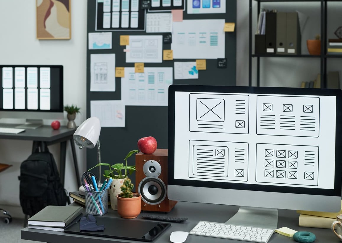
A wireframe is a low-fidelity blueprint of a webpage. Think of it as the architectural plan of a house before you choose paint colors or furniture. It shows where things go, not what they look like.
If you’re transitioning from photography or print design, here’s a useful comparison:
| Stage | Print / Photo Equivalent | Goal |
|---|---|---|
| Wireframe | Pencil sketch / contact sheet | Layout & hierarchy |
| Mockup | Edited photo / final color comp | Visual design |
| Prototype | Mock magazine flip-through | Interaction & flow |
A wireframe should be boring on purpose. Grey boxes, placeholder text, no real images. That’s a feature, not a bug.
Why Wireframing Matters (Especially for Visual Designers)
- It separates structure from aesthetics, which is the #1 mindset shift from print to UX.
- It speeds up client approvals because there’s nothing pretty to argue about.
- It exposes content gaps early (missing CTAs, weak headlines, unclear flow).
- It makes responsive design planning easier from day one.
How to Create a Wireframe for a Website: 7 Steps
Step 1: Define the Goal of the Page
Before you draw a single rectangle, answer three questions:
- Who is the user landing on this page?
- What action do you want them to take?
- What’s the single most important piece of information they need to see first?
If you can’t answer these, your wireframe will just be decoration.
Step 2: Gather Content and Inspiration
Collect the real (or near-real) content: headlines, paragraphs, image counts, product info. Then pull 3 to 5 reference sites you admire. Don’t copy them, but note patterns: where do they put the navigation, the hero, the social proof?
Step 3: Sketch on Paper First
Yes, paper. Even in 2026, nothing beats a pencil for fast iteration. Grab an A4 sheet, draw a phone-sized rectangle on one half and a desktop rectangle on the other, and sketch 3 to 5 variations in under 20 minutes.
Rules of paper sketching:
- Use only boxes, lines, and X’s for images.
- Don’t erase, draw a new version next to it.
- Time-box yourself. Constraint breeds creativity.
Step 4: Establish Layout Hierarchy
This is where photographers and graphic designers actually have an advantage. You already understand composition, leading lines, and focal points. Apply the same principles:
- F-pattern and Z-pattern: most users scan in these shapes. Place key info accordingly.
- Size = importance: the biggest element is what users see first.
- Whitespace is structure: it groups related items and separates unrelated ones.
- One primary CTA per screen: too many buttons = no decision.
Step 5: Add the Key UI Elements
Most website wireframes include the same building blocks. Here’s a checklist for a typical homepage:
| Section | Elements to Include |
|---|---|
| Header | Logo, nav menu, optional CTA button |
| Hero | Headline, subheadline, primary CTA, supporting visual placeholder |
| Value props | 3 to 4 icons or short blocks |
| Social proof | Testimonials, logos, reviews |
| Features / services | Repeating cards or alternating image/text blocks |
| Secondary CTA | Form, calendar booking, or contact block |
| Footer | Sitemap, socials, legal links, newsletter |
Step 6: Move to a Digital Wireframing Tool
Once your paper sketch feels right, recreate it digitally. You don’t need a complicated stack. Pick one of these:
- Figma: the industry standard, free for individuals, huge community of wireframe kits.
- Balsamiq: intentionally hand-drawn look, perfect for client meetings where you don’t want feedback on colors.
- Canva: great if you’re already using it for branding, has ready-made wireframe templates.
- Penpot: open source alternative to Figma, getting strong in 2026.
Tips when going digital:
- Stick to greyscale plus one accent color for CTAs.
- Use a real grid (12 columns is standard for desktop).
- Build mobile and desktop side by side, not one after the other.
- Name your layers. Future you will thank present you.
Step 7: Review, Annotate, and Iterate
Add small notes next to elements that need explanation: “sticky on scroll”, “opens modal”, “loads 6 items then paginates”. Share with a stakeholder, collect feedback, and revise. Plan on at least 2 to 3 rounds before moving to high-fidelity design.

Common Wireframing Mistakes (And How to Avoid Them)
- Designing visuals too early. If you’re picking fonts, you’ve skipped a step. Go back to greyscale.
- Using lorem ipsum everywhere. Real headlines reveal real layout problems. Fake text hides them.
- Forgetting mobile. Over 60% of web traffic in 2026 is mobile. Sketch it first if your audience is consumer-facing.
- Cramming everything above the fold. Users scroll. Trust them.
- Too many CTAs. One primary action per screen. Everything else is secondary.
- Skipping the empty and error states. What does the page look like with no content, or when something breaks?
From Wireframe to Mockup: The Bridge
Once your wireframe is approved, you move to the visual design phase. This is where your background as a graphic designer or photographer becomes a superpower. You bring typography, color theory, photo direction, and brand storytelling to a structure that’s already proven to work.
The wireframe handled the what and where. Now you handle the how it feels.

Quick Recap
- Define the page goal.
- Gather content and references.
- Sketch on paper.
- Establish hierarchy.
- Add UI elements.
- Build digitally in Figma, Balsamiq, Canva, or Penpot.
- Review, annotate, iterate.
FAQ
Do I need to know how to code to create a wireframe?
No. Wireframing is a design and thinking activity. You can build complete wireframes with paper or visual tools without writing a single line of HTML.
Can AI tools like ChatGPT create wireframes?
Yes, modern AI assistants can generate basic wireframe layouts and even export them to Figma. They’re useful for fast first drafts, but the strategic decisions (goal, hierarchy, content) still need a human designer.
What’s the best free tool to create wireframes?
Figma is the most popular free option in 2026, with the biggest library of free wireframe kits. Canva and Penpot are excellent alternatives depending on your workflow.
How long should it take to wireframe a website?
A small marketing site (5 to 7 pages) typically takes 1 to 3 days of focused wireframing, including 1 or 2 rounds of revisions. Larger projects scale from there.
Should I wireframe mobile or desktop first?
If your audience is mostly mobile, start mobile-first. The constraint forces clarity. For B2B or admin tools, desktop-first usually makes more sense.
What’s the difference between a wireframe, a mockup, and a prototype?
A wireframe is the structural blueprint, a mockup is the visual design with real colors and typography, and a prototype is an interactive version that simulates clicks and transitions.