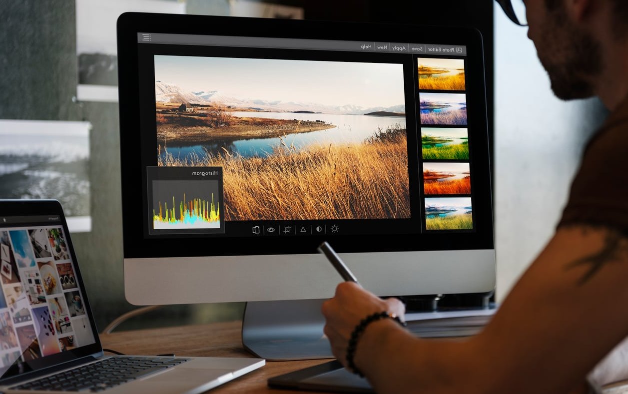

Ask ten photographers where color correction ends and color grading begins, and you will get ten different answers. Ask a beginner, and you will usually get a Lightroom catalog full of moody presets stacked on top of images that were never white balanced in the first place.
That is the real problem. Color correction vs color grading is not a style debate, it is an order-of-operations problem. Grade before you correct and you are painting a mood on top of a broken foundation. Correct first and the grade takes ten seconds instead of ten minutes.
In this guide we break down exactly which sliders belong to each stage in Lightroom Classic and Photoshop, walk through the same RAW wedding file processed both ways so you can see the difference, and give you a repeatable checklist you can run on every gallery this season.
The Short Answer
Color correction is technical. You are fixing the file so it matches reality: neutral whites, accurate skin tones, correct exposure, consistent shots across the same scene.
Color grading is creative. Once the file is accurate, you push it deliberately toward a look: warm and filmic, cool and editorial, faded blacks, split-toned shadows.
Correction answers “is this right?” Grading answers “is this me?” Related reading: Color Grading vs. Color Correction Process for Video.
| Color Correction | Color Grading | |
|---|---|---|
| Goal | Accuracy and consistency | Mood, emotion, brand identity |
| Nature | Objective, measurable | Subjective, taste driven |
| Order | Always first | Always second |
| Reference | A neutral gray, a white dress, real skin | Your portfolio, a film stock, a client mood board |
| Right or wrong? | Yes, there is a wrong answer | No, only consistent or inconsistent |
| Time per gallery | 70% of your editing time | 30% of your editing time |

What Color Correction Actually Is
Color correction is the process of neutralizing your RAW file so that what you see on screen matches what a human eye saw in the room. A wedding dress that reads as cream at the church should read as cream on export, not blue, not yellow.
The signs a photo still needs correcting
- Skin tones lean green under fluorescent hotel lighting or magenta under LED uplighting
- The white dress is not white, and the tuxedo is not neutral black
- Two frames shot ten seconds apart do not match each other
- Highlights on the veil are clipped to pure paper white
- Shadows in the suit are crushed with no detail in the fabric
- The image is a third of a stop underexposed compared to the frame before it
None of that is fixed by a preset. A preset applied to a green-cast image gives you a green-cast image with a preset on it.
Correction sliders in Lightroom Classic
These live almost entirely in the top half of the Develop module:
- Profile (Adobe Color, Adobe Portrait, or a camera-matching profile). This is your starting point, not a look.
- Lens Corrections and Chromatic Aberration removal. Fringing is a color error, so it belongs here.
- White Balance: Temp and Tint, ideally set with the eyedropper on something genuinely neutral.
- Exposure: get the midtones and skin where they belong.
- Highlights and Shadows: recover the dress, open the suit.
- Whites and Blacks: set your true white point and black point.
- Contrast: a modest technical contrast to restore normal tonal separation.
- Texture, Clarity, Dehaze when a shot is genuinely flat or hazy, used sparingly.
- Sync / Match Total Exposures across the same lighting scenario.
Correction tools in Photoshop
- Camera Raw Filter or the ACR dialog for the same white balance and tonal work
- Levels with the gray point eyedropper to neutralize a cast
- Curves per channel (Red, Green, Blue) to remove a stubborn cross-channel cast
- Selective Color on Neutrals to pull magenta or green out of gray areas
- Match Color when a set of frames from the same scene refuse to agree
- The Info panel readout, your only truly objective referee for skin tone values
The skin tone check that ends the guesswork
Hover the eyedropper over a lit area of forehead or cheek and read the RGB values in Photoshop, or the RGB percentages under the histogram in Lightroom. For most Caucasian skin, red should be highest, green in the middle, blue lowest, with a comfortable gap between red and blue. If blue outruns green, you have a magenta cast. If green outruns red, something has gone badly wrong with your white balance. Deeper skin tones follow the same R > G > B relationship, just at lower overall values. That single check is the difference between correcting and guessing.

What Color Grading Actually Is
Grading starts the moment your decisions stop being about accuracy and start being about feeling. You are no longer asking whether the dress is neutral. You are deciding that the shadows should carry a hint of teal because that is what your brand looks like.
Grading sliders in Lightroom Classic
- Tone Curve used stylistically: lifted blacks, an S curve for punch, a faded matte toe
- RGB channel curves: the single most powerful grading tool in Lightroom
- Color Grading panel: shadow, midtone and highlight wheels, plus Blending and Balance
- HSL / Color mixer: pulling orange in foliage, taming a loud red bridesmaid dress, shifting greens toward olive
- Calibration panel: primary hue and saturation shifts, the base of most film emulation looks
- Vibrance and Saturation as a final taste adjustment
- Grain and Vignette as finishing touches
Grading tools in Photoshop
- Color Lookup adjustment layers and 3D LUTs
- Gradient Map layers at low opacity or Soft Light blend mode
- Solid Color fill layers set to Exclusion or Soft Light for a tint
- Curves per channel used creatively rather than correctively
- Selective Color on individual color families
- Luminosity masks so the grade lands only in shadows or only in highlights
The overlap nobody mentions
Some tools appear in both lists, and that is the honest answer to the color correction vs color grading question. The tool does not decide the stage, your intent does. A red channel curve pulled to neutralize a cyan cast is correction. The exact same curve pushed to warm the highlights for mood is grading. Ask yourself: am I moving toward reality, or away from it on purpose?
The Same RAW File, Processed Both Ways
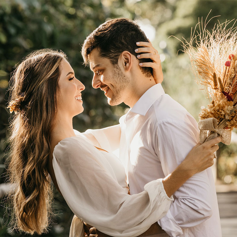
Take one frame from a golden hour couple portrait shot at f/2, ISO 400, in open shade with a warm sun behind. Here is what happens under three different treatments.
| Version | What was done | Result on screen |
|---|---|---|
| A. Straight RAW | Nothing. As-shot white balance at 5200K, flat profile. | Cool and blue in the shade, dress reads gray, skin looks lifeless, blown rim light on hair. |
| B. Corrected only | WB to 6100K, Tint +4, Exposure +0.45, Highlights -38, Shadows +22, Whites +9, Blacks -6, lens profile on. | Accurate, clean, publishable. The dress is white, skin reads R > G > B, hair detail recovered. It looks correct but generic. |
| C. Corrected then graded | Version B plus lifted blacks in the tone curve, shadows nudged to 210 hue at 8 saturation, highlights to 45 hue at 6, greens shifted toward olive in HSL, Vibrance +8, light grain. | Warm, filmic, cohesive with the rest of the gallery. Skin is still correct because the foundation underneath it is correct. |
| D. Graded only (the mistake) | Version A plus the exact same grade from version C, no correction at all. | Muddy. The teal shadow tint stacks on top of the existing blue cast, skin goes gray-green, and the dress turns a dull steel color. Same grade, ruined result. |
Versions C and D use identical grading settings. The only variable is whether the correction step happened first. That is the entire argument in one comparison.

The Order of Operations Checklist
Print this, tape it to your monitor, run it on every wedding.
Stage 1: Correct (do not skip, do not reorder)
- Cull first. Never edit an image you would not deliver.
- Set your camera profile and enable lens and CA corrections.
- Neutralize white balance on a genuinely neutral target.
- Set exposure for the skin, not for the histogram.
- Recover highlights, open shadows, then set white and black points.
- Verify skin tone with the RGB readout.
- Sync the corrected settings across the scene, then fine tune outliers.
Stage 2: Grade (only once stage 1 is done for the whole scene)
- Apply your look: tone curve shape, color grading wheels, calibration.
- Refine specific color families in HSL, especially greens and reds.
- Check skin again. If the grade broke your skin tones, dial the grade back, do not re-break the correction.
- Add finishing touches: grain, vignette, subtle clarity.
Stage 3: Local and retouch
- Masks: brighten faces, tame a hot window, calm a color-cast wall behind the couple.
- Photoshop for skin retouching, distraction removal, composites.
- Sharpening and export sizing last.
Why This Matters More at Weddings Than Anywhere Else
A wedding is the hardest color job in photography, and most photographers underestimate it. In one day you shoot:
- Window light in a hotel room, mixed with tungsten bathroom bulbs
- Deep shade under a church portico at 4800K
- Direct midday sun on a lawn
- Golden hour portraits swinging from 3200K to 6500K in twenty minutes
- A reception lit by magenta and blue DJ uplighting, orange candles, and your own flash all at once
No single grade survives all of that. What survives is correcting each lighting scenario to neutral first, then applying one consistent grade across every scenario. That is how galleries look cohesive from prep to last dance instead of like five different photographers shot them.
The mixed-lighting reception rule
At the reception, decide what is neutral before you touch a slider. Usually it is skin under your flash, not the ambient uplighting. Correct skin to neutral, then let the colored uplighting stay colored. If you try to neutralize the purple wall wash, you will turn the couple green.

The Five Mistakes That Cost Beginners the Most Time
- Applying a preset as step one. A preset is a grade. It assumes a corrected file. Load it after correction, then adjust.
- Fixing white balance with Vibrance and Saturation. Those are grading sliders. They cannot remove a cast, they only amplify it.
- Grading image by image. Correct per scene, grade per gallery. Otherwise nothing matches.
- Judging color on an uncalibrated screen. If you have never calibrated your monitor, every correction decision you have made was a guess. This is the single cheapest upgrade to your editing quality.
- Grading so hard it eats the skin. If the grade is strong enough to shift skin tones, mask it off the faces or reduce it. Clients forgive a lot, but not green skin in their portraits.
Quick Reference: Which Slider Belongs Where
| Lightroom Slider or Panel | Stage | Note |
|---|---|---|
| Profile | Correction | Set once, before anything else |
| Temp / Tint | Correction | Use the eyedropper, then trust your eyes |
| Exposure | Correction | Expose for skin |
| Highlights / Shadows | Correction | Recover the dress and the suit |
| Whites / Blacks | Correction | Sets the true tonal range |
| Contrast | Both | Technical first, stylistic later |
| Lens Corrections / CA | Correction | Removes color fringing |
| Tone Curve | Grading | Where your look really lives |
| Color Grading wheels | Grading | Keep saturation under 15 for subtlety |
| HSL / Color Mixer | Both | Orange luminance can be correction, green hue is grading |
| Calibration | Grading | Powerful, so move in small steps |
| Vibrance / Saturation | Grading | Never a cast-removal tool |
| Grain / Vignette | Grading | Always last |

Building a Preset That Respects the Split
The most useful thing you can do with this framework is rebuild your presets around it.
- Correct one representative image from each lighting scenario by hand.
- Grade that image until it matches your brand look.
- Save the preset with white balance and exposure unchecked. Save only the grading components: curve, color grading, HSL, calibration, grain.
- Now the preset carries your look and nothing else. You correct each scene, apply the same preset everywhere, and the gallery holds together.
That is also why bought presets so often disappoint. They usually bake white balance and exposure into the file, which means they are overwriting your correction with someone else’s guess about a scene they never shot.
FAQ
Do you color correct before color grading?
Yes, always. Color correction establishes an accurate, neutral base: white balance, exposure, contrast, black and white points. Color grading is applied on top of that base to create mood. Grading first means your creative choices are compensating for technical errors, which makes them unpredictable and impossible to repeat across a gallery.
Is color correction worth it?
It is the highest return step in the entire edit. Correct skin tones and accurate whites are what clients notice, even if they cannot name what they are seeing. A well corrected image with no grade at all looks professional. A heavily graded image with no correction looks like an amateur filter. If you only have time for one stage, correct. Full details on https://ziprecruiter.com.
What is the 60/30/10 rule in photography?
Borrowed from interior design, it suggests a balanced frame uses roughly 60 percent of a dominant color, 30 percent of a secondary color, and 10 percent of an accent color. In wedding work it is a useful grading sanity check: if your grade pushes the frame toward one overwhelming tint, you have lost that balance and the image starts to feel artificial.
Can color correction damage an image?
Not when you work on RAW files with non-destructive tools. Lightroom stores edits as instructions, and Photoshop adjustment layers can be turned off at any time. Damage comes from working on heavily compressed JPEGs, pushing exposure several stops, or stacking aggressive adjustments that clip highlights and shadows beyond recovery. Shoot RAW, edit non-destructively, and correction costs you nothing.
Is color grading the same in photography and video?
The principles are identical, only the tools change. Video editors use scopes, LUTs and node-based panels in DaVinci Resolve or Premiere Pro, while photographers use curves, HSL and color grading wheels in Lightroom and Photoshop. Both disciplines correct to neutral first and grade second, and both rely on scopes or numeric readouts rather than eyeballing alone.
How long should color correction take per wedding?
Once you have a system, plan on correcting per scene rather than per image. A typical eight hour wedding breaks down into roughly 10 to 15 lighting scenarios. Correct one image per scenario properly, sync it, then spend a few seconds per frame on outliers. Most photographers who adopt this order cut their editing time by a third within two or three galleries.
Do I need a calibrated monitor for this?
For correction, yes. You cannot make objective color decisions on a screen that lies to you, and the mismatch shows up immediately in print orders and album proofs. A hardware calibrator is inexpensive compared with reprinting an album, and it removes the single biggest variable in your workflow.
Final Word
The color correction vs color grading distinction is not academic. It is a workflow decision that determines whether your galleries look cohesive or chaotic, and whether editing takes you two days or five.
Correct until the image is true. Grade until the image is yours. Never in the other order.
Pick one RAW file from your last wedding tonight, process it the two ways described above, and put the results side by side. Once you see version C next to version D, you will never grade a raw file again.